The Sailor Moon collection from Colour Pop sold out in, what? About an hour for the entire thing? Although I didn’t get everything I wanted (I’m not bitter, honest), I was lucky enough to grab a couple of items, including the Queen of the collection: The Pretty Guardian Palette.
I ain’t going to lie. I got it because it was Sailor Moon. I’d never even used Colour Pop before this order. I’d have bought this collection if it was put out on any website, or handed over with a box of cheese in McDonalds. This meant I was jumping in with no preconceptions about the brand and what quality to expect. So, what did I think? Read on to find out!
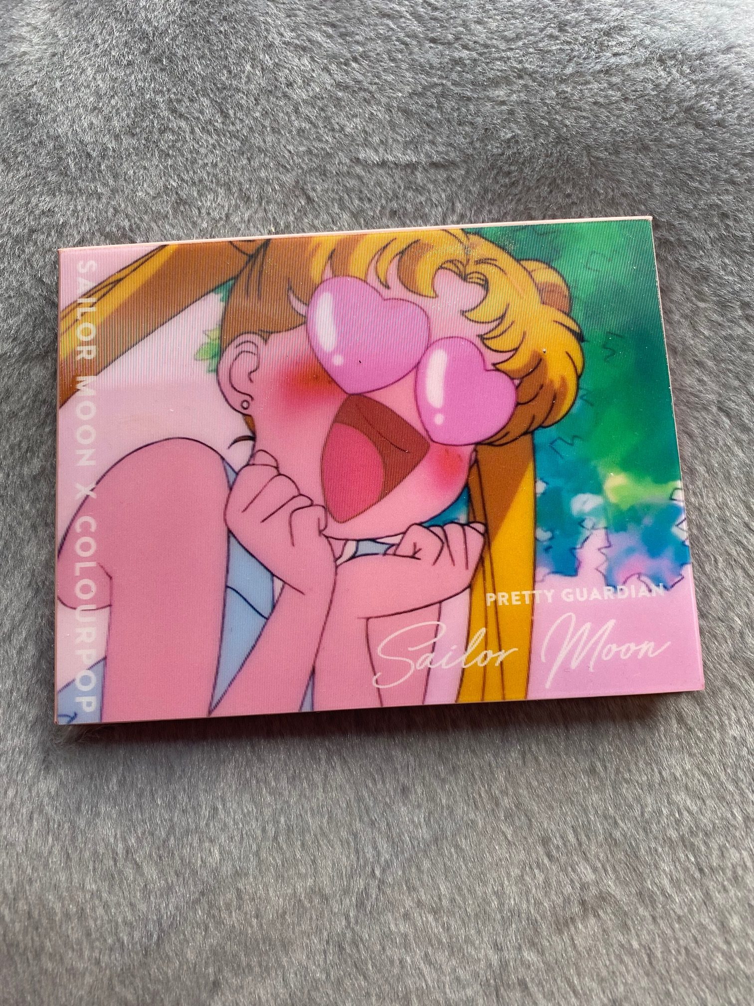
The Packaging
We have to talk about the packaging first. Sensory heaven, folks. Sensory heaven. Thanks to a cute holographic cover that changes Sailor Moon’s giddy expression, you can zip your nail up and down for that sweet zig-zag sensation. If you can look beyond the holographic exterior and actually get inside, then you’ll find a cute selection of pastel colours in a very pretty and girly package.
You’ll also notice there’s no mirror, which is a little annoying, but it does obviously keep the price point way down at $20, not to mention the weight. Considering how it’s very lightweight and a cute compact size, it’s tremendously travel friendly and very easy to pop in a bag.
Although simple and cheap in price, it doesn’t feel cheap in quality. It’s a solid little kit and so far it’s not gotten damaged from how I’ve been treating it.
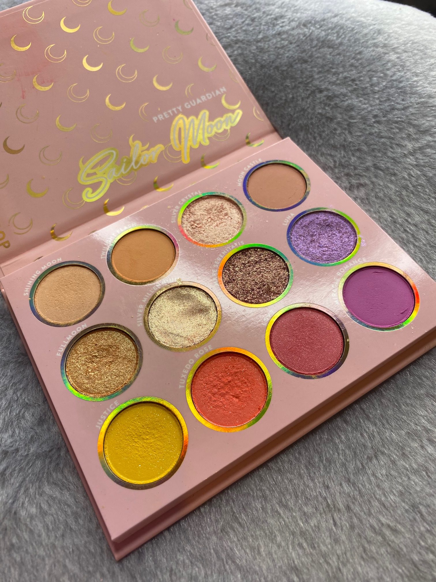
The Colours
In terms of the aesthetic, yeah, it’s authentically Sailor Moon. The layout and shade names are gorgeous, while the range of colours looks right out of a Sailor Moon backdrop with soft sleepy pastels. They nailed it.
The full list of colours as per Colour Pop’s descriptions are:
Shining Moon: pale peach with hot pink pinpoints
Twilight Flash: vibrant tangerine
Silver Crystal: soft pink with a gold flip
Moon Castle: soft coral
Full Moon: yellow orange with a gold flip
Silver Millennium: yellow gold
Mare Serenitatis: mid-toned pink with pinpoints of gold
Luna: iridescent lavender
Justice: yellow with gold and silver pinpoints
Tuxedo Rose: vibrant coral red with silver pinpoints
Love: rosey pink with silver pinpoints
Miracle Romance: orchid
Luna is my favourite, hands down. It’s a purple shimmery shade that’s pigmented as hell and looks super pretty no matter where I put it. Just one swipe across my lid and it’s bursting for attention.
The most questionable addition is Silver Millennium which is more of a cream and downright impossible to put on with a brush. It’s a little odd that it’s just hiding there in plain sight with the others. I also doubt it’ll last very long, after just popping it on my lids once it already had a noticeable chunk missing from it. Granted, now that I actually understand its texture I won’t be going in like I’m digging for treasure.
At first Silver Millennium left me feeling like I wouldn’t have much use for it, I was actually disappointed by its inclusion, but I tried gently applying it on top of Tuxedo Rose and it immediately brought a lovely flashy shimmer to what had been a fairly matte colour. Not bad! Since then I’ve used it the same way, to lightly pepper on top of the mattes for that extra flash.
Speaking of Tuxedo Rose, fantastic name aside, it’s a little redundant when Justice is right there. Both are a very similar coral-esque colour, and both have little flecks of silver glitter in too. Having tested them both in the same look, side-by-side as well, I feel like it’s maybe a waste of a slot when they could have done something different with it. That said, both are still great colours on their own.
As for how the rest behave, a couple of shades dropped a lot of fallout in the pan, but once it was on the eyes I didn’t have any issues. The texture left me totally happy and when it came to blending, they all went together excellently. The looks I created all felt like they fit the wholesome and adorable aesthetic of the anime while being mega pigmented.
For the price I was expecting some issues but I truthfully haven’t come across any. The quality is brilliant and what I’d expect from a much more premium palette.
The only potential negative I can talk about is that the colours look a little different in the pan vs. on the eye. On the eye they look more true to Sailor Moon’s aesthetic, they’re soft and dreamy, but in the pan they’re a bit stronger. This might take you off guard if you’ve only seen photos of the palette itself.
Conclusion
Yeah I love it. It’s not perfect, like I said I have a couple issues with the colour choices and Silver Millennium, but overall it’s a great palette. It barely costs anything for what it is, the colours behave themselves beautifully while living up to the brand and feeling like a true tie-in to a beloved series. This is one you can safely pick up, so if you missed out the first time, get ready for that restock because it’s going to be worth the wait.
Liked:
Sensory heaven case
(Mostly) Great choice of colours
Cute and compact
Disliked:
Silver Millennium isn’t powder
A couple of colours are redundant